A Process Story: BanhMi-Ni
How this Vietnamese sandwich shop pop-up logo came to be.

I met Top Chef Season 15 contestant, Chef Tu David Phu, at one of his hosted dinners. The dinner was a generous and delicious trade for completing two hours of design work on one of his original brands, Ăn, a nine-course Vietnamese pop-up dinner series. Tu’s delicious cooking and killer personality made it a no brainer to work with him on future projects.
A few months later, he reached out about a banh-mi pop-up idea he had. A banh-mi is a cross-collaboration of both Vietnamese and French tastes. It’s a sandwich traditionally made with a long baguette bread and fresh herbs such as cilantro, pickled carrots, pickled daikon, jalapeños, and pâté.

To start off his new pop-up series idea, Tu wanted a logo for his new brand, BanhMi-Ni. Of course I was happy to help him out.
Week 0: Project Agreement
While I put together a project schedule and agreement, I went ahead and drew up a few mood-boards based on initial conversations we had. Insights from our conversations included some goals and how Tu wanted the name spelled, capitalized, and if we were to include any supportive text such as “sandwiches”.

Mood-boards
A great way to jumpstart a design conversation with clients is by using mood-boards. Mood-boards can get you and your client focused on specific design elements. It’s also fun! Just look at how popular Pinterest is.
I started with a color mood-board, focusing on Tu’s goal to emphasis a fresh healthy sandwich choice. Tu makes sure his ingredients are organic and farmed locally, so health was initially a very important goal to hit. I also included a bolder color set, which emphasizes the bold flavor of banh-mi sandwiches.

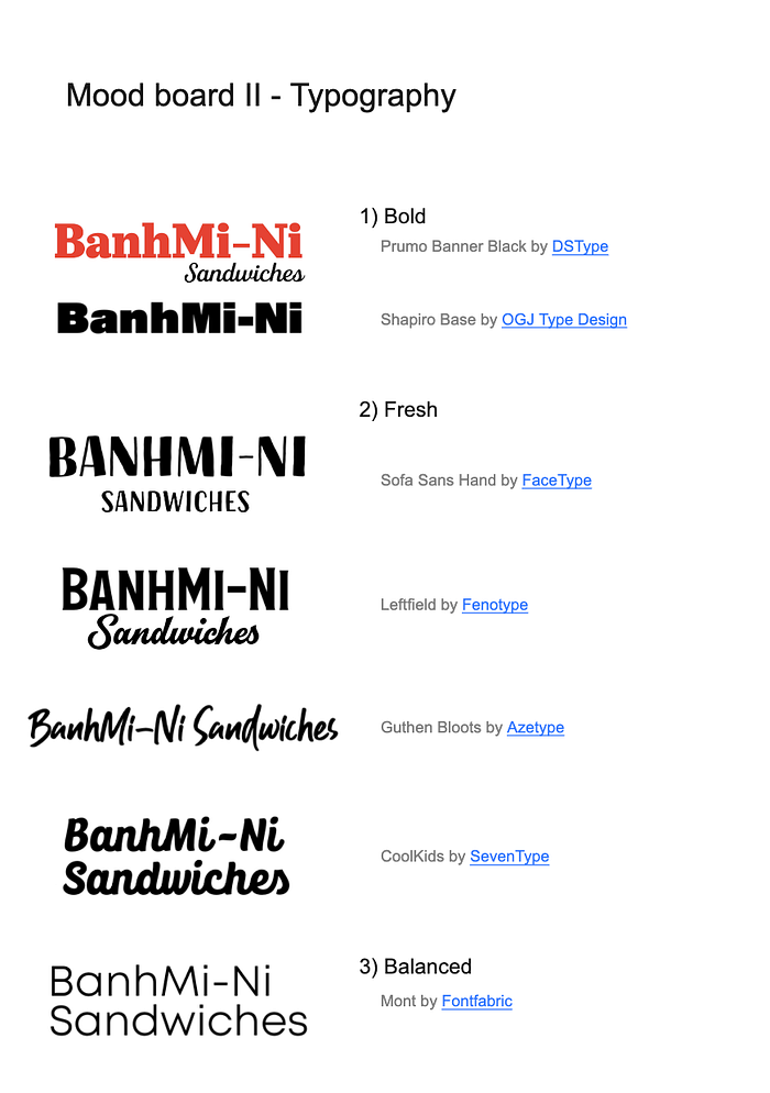
Typography is perhaps more important than color. Typography can make or break a logo, so thinking about typography is a particularly important step in the process. During our initial conversation, I had asked Tu to send over a few logos he admires and we discussed which elements he liked from each. Most of the logos he chose had balanced sans-serif typography with a supportive shape element.
With bold flavor in mind, I included a few fonts which stray away from the flavorless san-serif fonts. For ease of discussion, I grouped the mood-board typography under key words which reflect back to the goals of the BanhMi-Ni brand;
bold, fresh, balanced.
The elements within a logo should help tell a story about the brand. Texture and shape can be easy elements to tap into for added meaning. For example, a dotted texture could reflect a banh-mi’s flavor while a rounded shape could reflect an ingredient such as a sliced jalapeño or the long baguette.
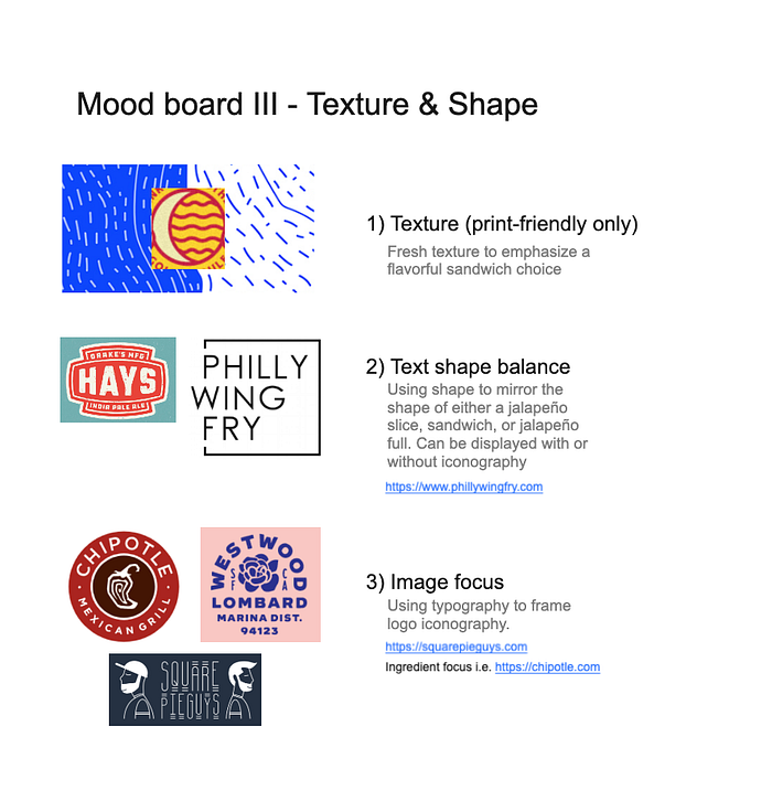
A logo isn’t limited to just color, typography, texture, and shapes. Iconography can also be included. Two of the three logos Tu liked had iconography, so I made sure we would explore a few image-focused ideas such as the sandwich itself or its ingredients.
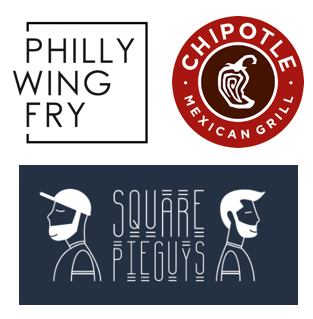
Iconography isn’t always necessary to include within a logo, but when it’s present, it is typically displayed above, below, or next to the logo’s typography. Typography and shape can even frame the iconography such as in the Chipotle logo.
Week 1: Sketch Phase
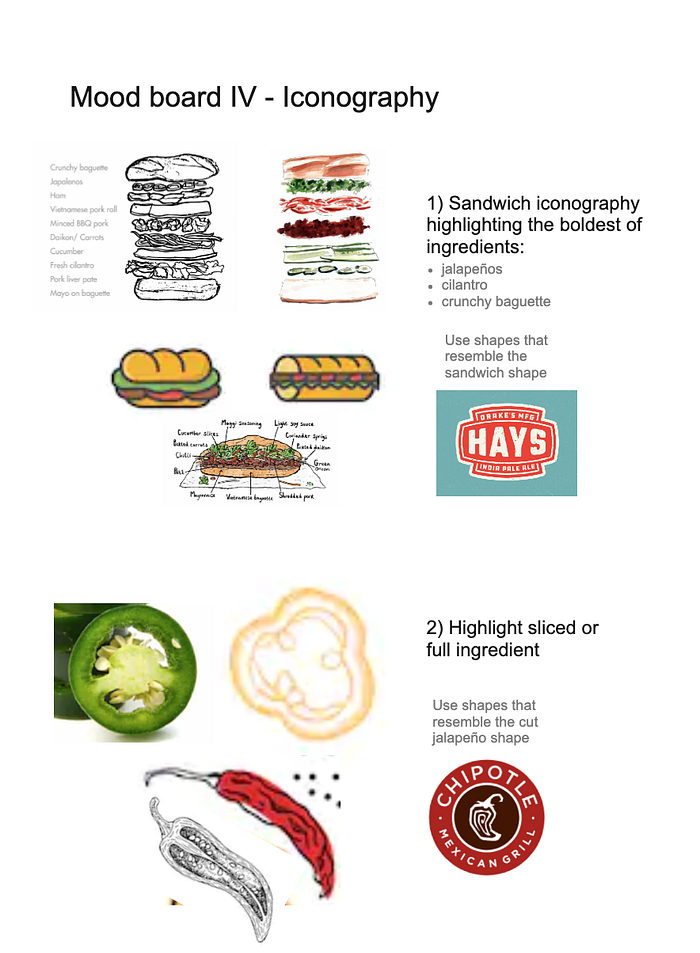
We discussed the mood-boards and ideas we wanted to focus on in the initial sketch phase. We liked the idea of focusing on the sandwich and a few key ingredients. I first explored jalapeños, both full profile and sliced views. Then I explored the sandwich itself, focusing on the long baguette. Lastly, cilantro.
At this point we were focused on iconography, so I predominately used sans-serif typography to pair with the sketched ideas. For discussion, I also slipped in a few sketches without iconography and some with script typography, also know as cursive.

Week 2: Logo Options Phase
We reviewed the exploratory sketches and decided to forgo using iconography because Tu really liked the direction of sketches I had slipped in which had no iconography. The sketch he was most fond had both a sans-serif and a script typeface set within an oval shape. The other sketch he liked was also script, which I had set on a 30 degree angled slant.
In the next sketch phase, I explored using the 30 degree slant, script and sans-serif typography, and a round shape to reference a baguette.

Week 3: Revise Logo Phase
Tu loved two of the sketches with script typography and couldn’t decide which one he liked best. Both used the idea of a round baguette shape and both had sans-serif support text below the script typography. One had all the elements including the 30 degree slant. We agreed on revising the two logo options he liked best for further discussion.

During this revision process, I broke down the typography from the sketches to create a unique script typeface. The custom logo font is inspired by typography elements from both Hickory Jack and Linoleo Script.

Week 4: Finalization Phase
Of the two revised logos, Tu was really fond of the option with the 30 degree slant. We agreed to finalize the option and take a look at color, minor tweaks to the typography, and shape.
Revisiting our mood-boards, we discussed using yellow to pair with the baguette shape. Tu was also envisioning a neon-sign for his shop with the finalized logo, so I provided options where the typography could easily be the yellow light of the neon sign.

Tu really liked the purple and yellow combo, with a minor tweak to the baguette background shape. I finalized the decided logo with minor typography and shape tweaks before delivering a final presentation and assets to conclude the project.

You can view this entire project process here or check out my other projects here.
Pop-Up Details
If you’re in the Oakland California area, give Chef Tu’s pop-up a try. They’re now serving pho as well!
Location
COPPER SPOON
4031 BROADWAY
OAKLAND, CA
Hours & Menu , Instagram , Facebook , Twitter

